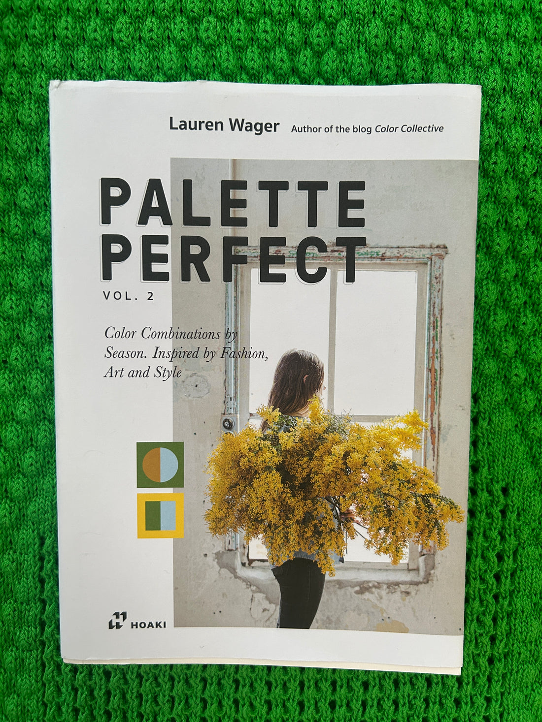
Beklina has forever been obsessed with color. It influences all that we make and do. When Lauren contacted us to request permission to include several of our photos in her two books, Palette Perfect One & Two we said yes of course!


When working on your recent book, what came first... a photo, palette, or a single color? I'm wondering what your process is like in general.
It always starts with an image, or pairing, that inspires me! I pull the palettes from there. Sometimes if I see an image that sparks a certain mood, I’ll search for hours for images and colors that evoke that mood and create a mini mood board :)
Do you have a color or color-combination that you're not loving so much, now or maybe when you were younger?
I’ve never been a big fan of bright purple. I can appreciate the color on other people, and in certain way works, but I don’t own anything purple in my closet and it’s probably not in many of my palettes either.
Do you reference your books when you're working on other projects?
Yes! The reason why I started my blog Color Collective, the books are based on, 13 years ago is because I was creating surface pattern designs and having a hard time coming up with new palettes. I started pulling palettes from art/design/fashion images that I was inspired by, and it became a digital collection of color palettes. I still use them in every project I’m working on!
Current favorite color or palette to wear…
Over the summer lime was at the top of my list, in fall it was olive, and now that it’s winter I’m all about forest green. Green has always been my favorite color!
How do you feel about white; first things that comes into your head?
Blank slate, endless possibilities, new beginnings. LOVE white.
What do you collect?
I have a lot of collections! To name a few.. rocks, stickers, vintage wrapping paper and fabric.
City or village?
Urban Village?!
I want to ask you more about purple. Do you have an example, a common reference, like grape juice, that is the purple you're referring to, or is more like a purple standard crayola maker. What about pastel purples, lilac and lavender?
Standard Crayola Marker purple. I've attached an image for reference, because I'm not sure how else to describe; maybe you know a better name for it? I love pastel purples like lilac and lavender, deep plum and eggplant, love mauve. It's just that true purple color, I am not a fan!

I feel like sometimes colors get "abused" from certain industries, and then it's hard to see them objectively. I'm thinking of those dark forest plastic chairs that were mass produced in the 90's, or pale blue house siding on California houses. Does this idea resonate for you at all? If yes, what is a color or hue that you feel like have been "abused" in or for your eye?
Yes, I see what you mean; for some reason the colors that are abused are only abused for me in that particular format. Like I wouldn't want to paint my house pale blue, but I still might like a pale blue dress, or a pale blue accent in my home. I think what resonates more for me with this idea is an actual pairing of colors. Like Barney, I can never see that magenta purple combined with grass green without thinking of barney; it's totally ruined.
I feel you on green. I suffer from migraines, and one of my coping tools is color mediation therapy. Green is my most go-to comfort-healing color. I imagine all the greens of the Amazon jungle passing through me. Kinda like, trusting in green's wavelengths to realign, or wash away, imbalance, like a tuning fork, if that makes sense.
Yes, definitely! It's healing, brings life, freshness, new beginnings and growth :)
One more question, how do you feel about black?
Black is timeless, effortless, mysterious, sleek, and always in style. I wear a lot of black.
Follow Lauren @laurenwager
